In the last few years, Mapbox has transitioned from being a web mapping platform to also supporting vehicle navigation, and being a provider of data (geocoding, etc). A particularly interesting example of this is their recent telemetry data offering. To date, Mapbox Telemetry has primarily been used to refine its own maps, but recently this program has been reconfigured to provide a new product called Mapbox Movement (MM). MM is an index of human movement, we will come to why that is important in a moment. Firstly you should know 2 key points about this source of data:
- There is no record of advertising identifiers, meaning this data is completely anonymized
- This data is aggregated to approximately a city block scale, if there aren’t enough data points available, the aggregation is ignored.
This index simply shows how busy a particular place is. This can be understood in the context of a baseline which is calculated based on historical data capture.
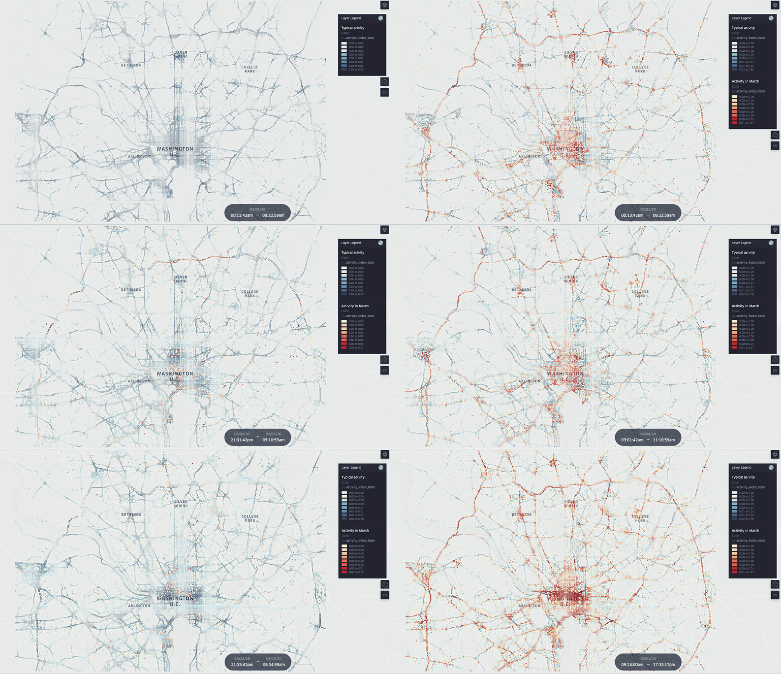
What does Mapbox Movement shows us?
I’ve often said that where humans are moving there is value to be captured or measured. Measuring movement can show us a number of interesting things, here are a few examples to consider:
- Primary and secondary Commuter routes – knowing where people move through a city and where they go if those routes are blocked
- How many eyes on that billboard?
- Retail location comparisons
- Commodity demand – movement in vehicles is a good surrogate variable for gasoline sales.
This list is by no means exhaustive, different people with different experiences will see different opportunities in this data.
Why is this important now?
One new and critical use of MM is in measuring how communities have slowed down during lockdowns, curfews and quarantines. During the present global pandemic (COVID-19) we have seen a tremendous drop in human activity
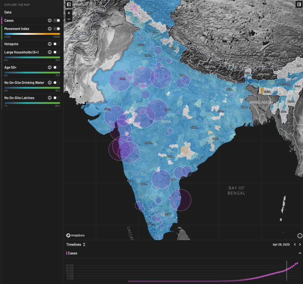
More recently (this article is being written June 1st), measurable human movement has started to increase again. In the early stages of the pandemic, we saw that there was a correlation between spikes in movement and increases in Rt 2-3 weeks later, where R is a measure of the rate of infection.
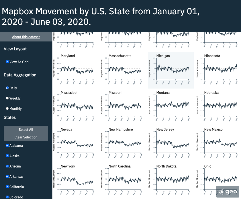
When we look at the movement index for the US States we can see some interesting patterns in how different States have responded to movement restrictions, for example:
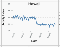
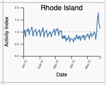
This kind of tool can be used to broadly, but non-invasively determine if health policies are succeeding.
Upstream Geospatial
Another point to consider here is the transition from Mapbox as a visualization platform to Mapbox as an upstream geospatial data provider. In essence, Mapbox has built a virtuous cycle between their frontend mapping technology and the use of that technology as a data product in itself.
This is an interesting strategic move for Mapbox, but the form that this data takes should also be of interest to our geospatial community. Consider that this product is interesting in both a spatial and aspatial manner. Consider that this data will likely have a bigger audience in companies which are not linked to the geospatial sector. In fact, they might not need visualizations at all, but simply access a data feed via API to be pulled into some kind of model.
At Sparkgeo we have set up a daily feed of activity across all US States. This is updated every day and shows the change in the Mapbox Movement against a calculated baseline. This data is accessed as a data stream which could feed a map, or a series of charts or a model, welcome to the future of upstream geospatial.
We would love your feedback.

