In Part 1 of this series, we used satellite imagery to understand the impact of recent droughts on crop growth in the Canadian province of Alberta. In Part 2, we continue and extend our previous analysis, taking a more detailed view of specific areas in the province.
But first it is worth mentioning why I’m writing this in the first place. Why look at agricultural drought? And why specifically in Alberta?
This story is a personal one for me. I have lived in southern Alberta—and around farming—for the majority of my life. While I am not a farmer myself, I know and have worked with many farmers in this province. These data aren’t just colourful pictures, or lines on a graph; they represent the the triumphs and failures of people whose livelihoods are tied to the land, and to the whims of increasingly unpredictable weather. Unsurprisingly, many farmers have been found to suffer from high levels of stress, poor mental health, and an elevated risk of suicide.
Often in earth observation, the scale is so large and the vantage so remote, that we lose sight of the lived reality of the people and organisms that are directly affected by the phenomena we study. Yet this local perspective is critical for geospatial practitioners to keep in mind to help inform and shape the work we do.
Taking a Closer Look
While the analysis in Part 1 is useful for understanding of the differences between years, there were some limitations. Firstly, we used data from the MODIS sensor, which has low spatial detail (each pixel covers an area of about 250 meters by 250 meters). And we only looked at the maximum NDVI for each pixel in each year, rather than looking at a full seasonal time series.
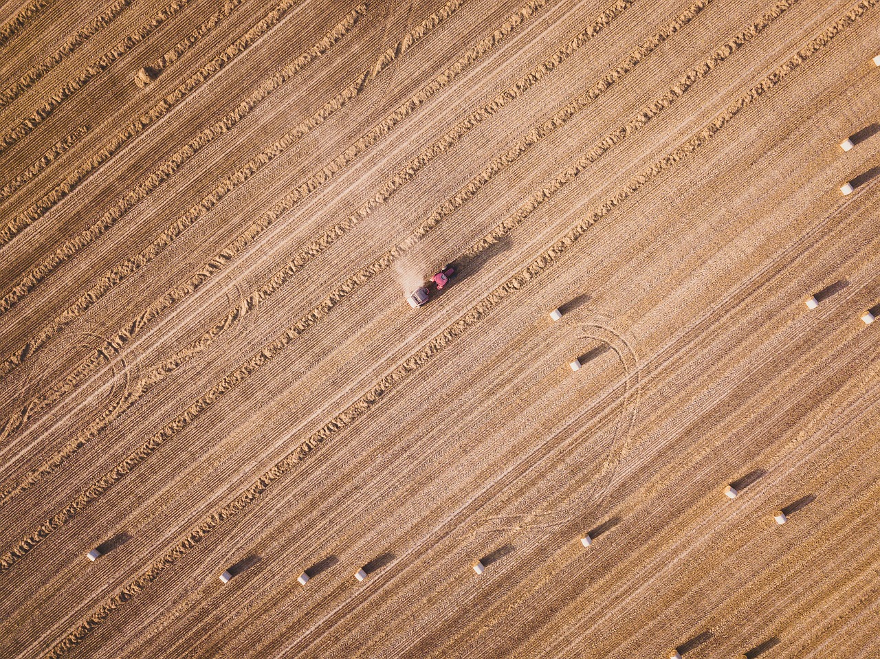
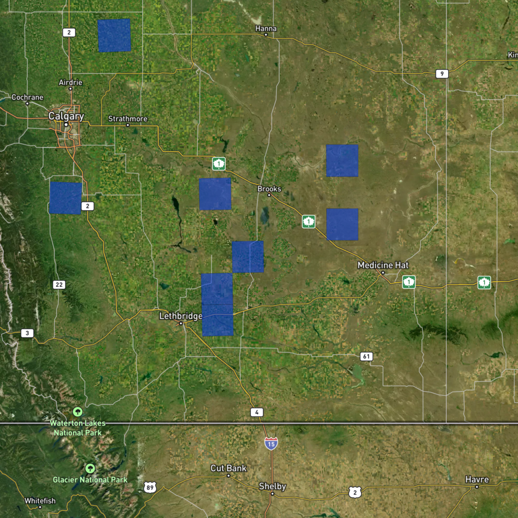
To help further our understanding, we selected 8 areas of interest (AOIs) in southern Alberta to study in more detail. We only selected areas in the south of the province, as this region was the most impacted in 2023 according to our findings in Part 1. The 8 AOIS cover the main types of vegetation in the region, including dryland crops, irrigated crops, along with pastures and grasslands.
Planet Fusion Monitoring: daily crop monitoring at a high spatial resolution
For this study we used the Planet Fusion Monitoring data product provided by Planet (Planet Labs PBC). This product uses data from the PlanetScope satellite constellation which is owned and operated by Planet. PlanetScope is the largest constellation of earth observation satellites, with about 130 active satellites. The combined constellation can provide an image just about every day, over most of the earth with a pixel size of 3 meters by 3 meters.
The Planet Fusion Monitoring product uses a machine learning data processing pipeline, combining data from other satellite sensors to enhance the PlanetScope data quality and to fill in missing data. The result is a high quality and unbroken daily imagery time series.
We retrieved daily Planet Fusion images from April 1st to September 30th for the last 6 years over our 8 study AOIs. With that imagery, we calculated the average NDVI for each day, and created time-series gifs to visualize the crop growth patterns.
We created an interactive dashboard using Streamlit to explore the study results.
Study Findings
Examining the results presented in the dashboard, there are some key observations to discuss. We encourage readers to explore the results themselves, but we have also included some visuals from the dashboard to accompany the discussion below.
2020 was the best year across all AOIs
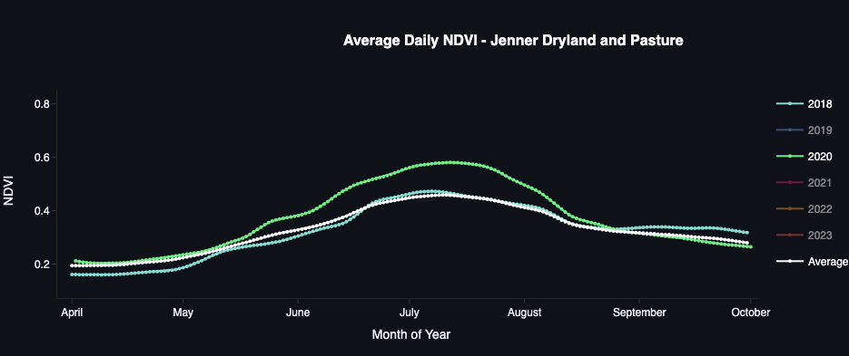
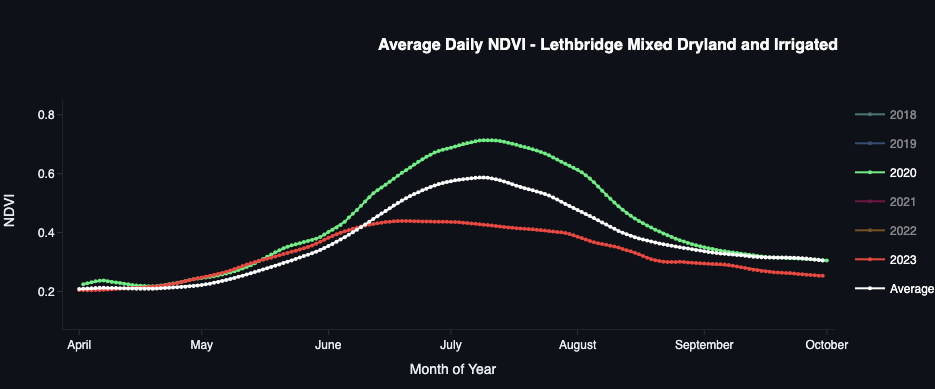
From our results it is clear that 2020 was the best year for crop growth overall. Comparing the different AOIs, NDVI for 2020 was either the highest overall or tied with another year for the top spot. This was the case for dryland crops (Figure 3), irrigated crops (Figure 4), and pastures (Figure 5).
This finding is in line with our results in Part 1, where we found that crop growth in the southern part of the province was exceptionally good. This local news article also supports our findings.
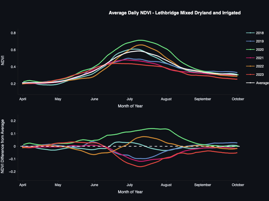
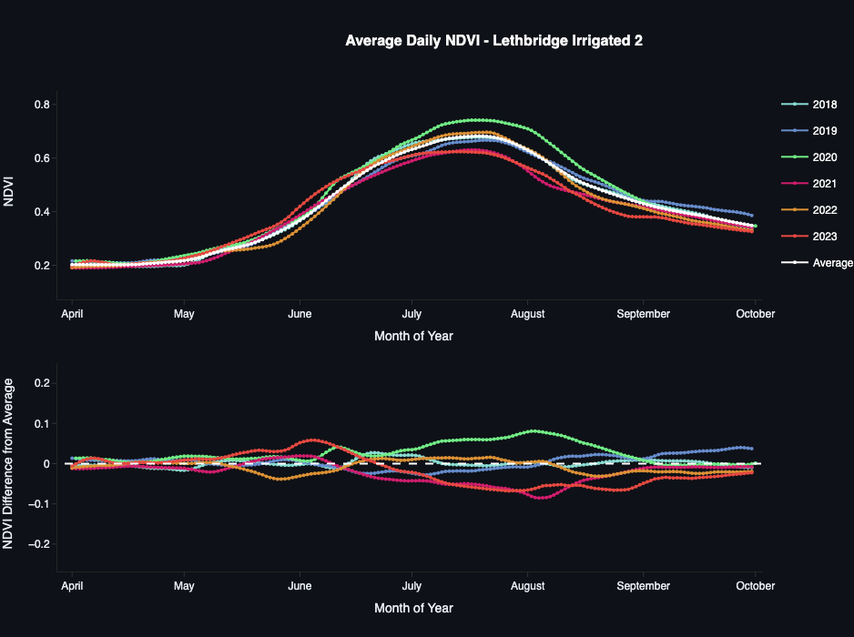
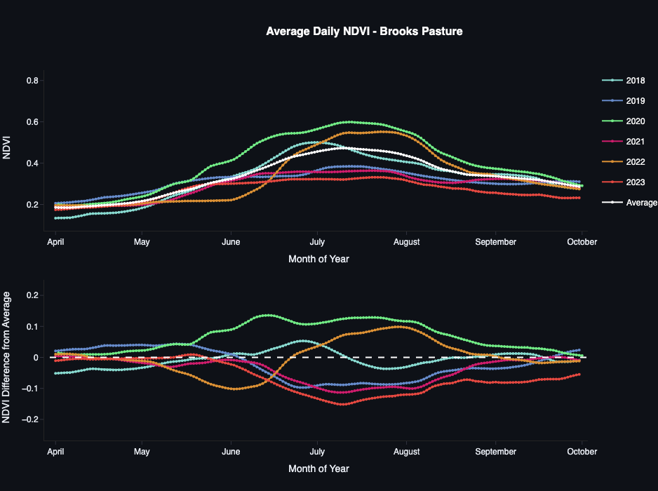
Figure 6 shows a time lapse video for the “Jenner Dryland and Pasture” AOI, comparing 2018 with 2020. 2018 NDVI was close to the average for that AOI. In the videos, darker green indicates higher NDVI. From the video we see that both the crops and pasture achieved a higher, longer lasting peak NDVI in 2020.
2021 and 2023 droughts impacts are clear. 2019 also low for some AOIs
In Part 1 we discussed how 2021 was another severe drought year for the province, considered the worst in over 60 years. Our results in this study are in line with Part 1. Both 2021 and 2023 showed the lowest overall NDVI for all AOIs. For some AOIs, 2021 was lower, while for others, 2023 was lower; but both years were similar for most AOIs.
NDVI for 2019 was also quite low for several AOIs, showing similar trends to 2021 and 2023 (Figures 7 and 8). For other locations this was not the case, with 2019 NDVI appearing close to average or even above-average (Figure 9). It is possible if drought conditions existed in 2019, they were not as widespread as the 2021 and 2023 droughts. Some other factors aside from drought could also have caused the low 2019 NDVI seen in some locations.
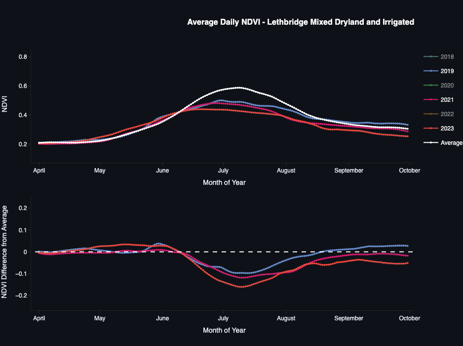
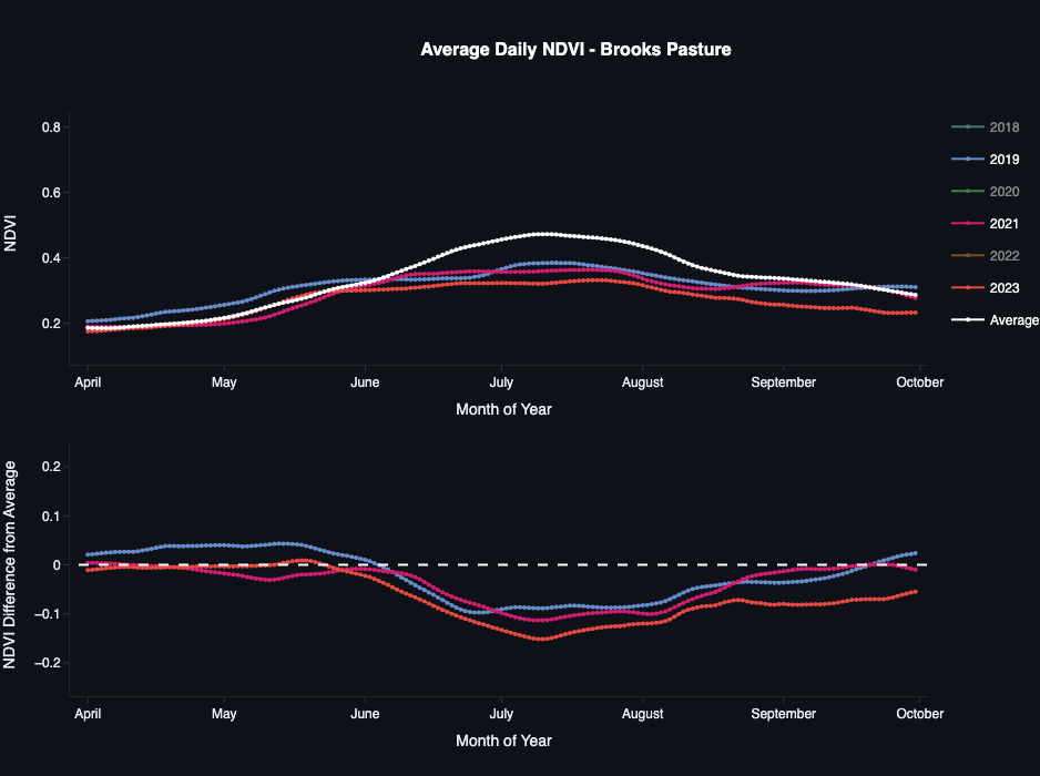
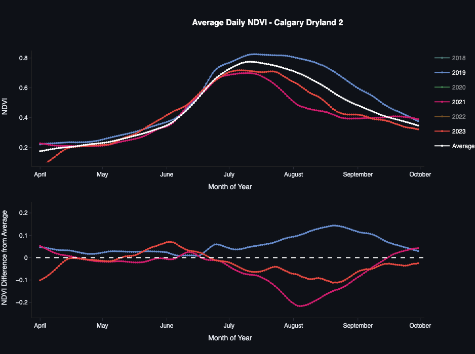
Figure 10 shows an NDVI time lapse comparing 2020 with 2023 for the “Lethbridge Mixed Dryland and Irrigated” AOI. Comparing 2020, the year with the highest NDVI, to 2023, the difference can clearly be seen. While the irrigated fields (appearing as circles) seem to grow well in both years, the dryland and pasture fields appear to barely grow at all in 2023.
Irrigation reduces drought impact
It’s clear from our findings that dryland crops and pastures suffered reduced growth from the droughts in 2021 and 2023. However, as we found in Part 1, irrigation can reduce the impact of drought.
Figure 11 shows the daily NDVI for the “Lethbridge Irrigated 2” AOI for 2020, 2021, 2023, along with the overall average. The plot shows that the reduction in NDVI between the two drought years for this location was not as severe as with the dryland AOIs.
There is some reduction, which may imply that even with irrigation crops suffer during droughts. However, we should recall that the plots show the average across the entire AOI. This means that if there are dryland crops or pastures within the scene, they would bring down the average during a drought year.
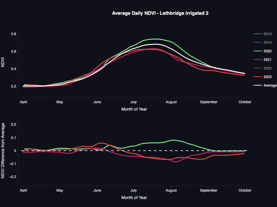
To understand better we can look at the NDVI time lapse in Figure 12. The video compares crop growth in 2020 with 2023. In the timelapse we can see that while most of the scene is made up of irrigated crops (fields appearing circular), there are also a significant amount of dryland crops and pastures in the north, south-western, and south-eastern parts of the AOI.
NDVI for the irrigated fields appears mostly similar between the two years, while dryland fields are significantly reduced in 2023. Thus it seems possible that the NDVI decrease in 2021 and 2023 as shown in Figure 11 is mostly due to these dryland areas, with irrigated fields largely unaffected.
This is not a surprising finding, as irrigation can provide stable and regular water to crops regardless of the local moisture conditions, as long as water remains in reservoirs to supply it.
Caveats and Limitations
With this project along with our work in Part 1, we’ve shown how time series images from satellites can help us to monitor and assess the impact of drought on crop growth.
The two studies are complementary: in Part 1, we showed how we can use images with low detail but broad coverage to track changes in crop condition across a large area. From the overview provided in Part 1, we were able to select several smaller locations to study using frequent, high resolution images.
In both studies, being able to observe change between multiple years provided important context to help us understand how significant these droughts actually were.
This analysis is fairly superficial, but a good start. Much more work would be needed to fully understand and quantify drought damage in Alberta, assess long term trends, and predict the risk of future droughts. Some next steps may be to look at a longer time series of data, as well as other datasets like weather and climate models.
In addition to the above, there are some other important limitations to note:
- Remote sensing data is subject to uncertainty and errors from things like sensor calibration, the atmosphere, terrain, and sensor noise. Advanced processing techniques like those used in the Planet Fusion data can help mitigate these issues, but they are unlikely to fully remove them.
- While NDVI is a useful way to measure crop health, it is not perfect. Aside from being subject to errors in the images it is derived from, different crops may show different NDVI patterns, and their response to stress may also differ. Some crops may show a strong change in NDVI, while others may only change a bit, despite experiencing severe stress.
- Related to the above, farmers in Canada often change the crops they grow in particular fields between seasons. In this study we did not control for crop type, and did not analyze individual fields. Instead, we averaged the NDVI signal over large areas, with the assumption that the relative proportion of different crop types would be similar from year to year. This assumption may not always be valid, and contributes some uncertainty to the analysis.
- Planet Fusion fills in missing data (for example, pixels blocked by clouds) by interpolating from other images in the time series and other satellite data. This means that for any given day in the time series, some or all of the pixels may be synthetic.
Crops generally change fairly slowly from day to day, so some amount of synthetic data is unlikely to be a problem; however, if there is a long gap with no valid data available (for instance, several weeks of cloud cover), then the likelihood of errors increases.
Planet Fusion provides metadata which can inform the user of which pixels in an image are based on real data and which are synthetic, but we did not use this information for the project.
Irrigation to the rescue?
Since irrigation appears to largely prevent crop damage from drought, can we just irrigate our way out of the problem? If we converted dryland fields to irrigated, we could grow healthy crops, regardless of the local amount of rain. While expanding irrigation may be part of the solution, there are some reasons why this is unlikely to solve the problem on its own.
Firstly, irrigation depends on expensive equipment, requiring high capacity pumps, long lengths of pipe, and large sprinkler systems. For many farmers, profit margins can be quite slim, and converting their fields to use irrigation may not be financially attainable.
Even if growers can afford it, irrigation infrastructure may not be available near them. Irrigation relies on large man-made reservoirs and hundreds of kilometers of canals and pipelines to deliver the water from the reservoirs to farmers’ fields. This infrastructure is not available in all parts of the province. Most of the irrigation infrastructure in Alberta is located in the southern part of the province. Thus for farmers in central or northern Alberta, irrigation may not be an option.
Finally, aside from equipment costs and infrastructure, there is a more fundamental issue: there is probably not enough water available to irrigate all the crops grown in the province. The water stored in reservoirs comes from local rivers which are largely supplied by snow melt in their mountain headwaters.
In southern Alberta, the majority of reservoirs, canals, and pipelines are managed by 13 different irrigation districts. These districts allocate water for various uses, including irrigation, municipal water supply, recreation, and use by the river ecosystems. The districts issue water rights to growers, and only a certain number of allocations are made. If a farmer does not already have water rights, they either need to purchase the allocation from another grower, or wait for more allocations to be made. So even if a grower can afford to convert their land from dryland to irrigated, without water rights they are unable to do so.
Irrigation capacity will likely expand in the future, through construction of additional water storage and increased water use efficiency; however, the ability to expand capacity is finite, even assuming river streamflow remains constant.
Unfortunately, mountain snow pack has been decreasing for years, and the snow is melting earlier in the spring. This is reducing water availability during the summer, when crops need it the most. Consequently, reservoirs are being pushed to their limits. This year, irrigation districts were forced to reduce their water allocations multiple times as reservoirs reached critically low levels, including one—the Oldman Reservoir—that reached its lowest level since being constructed in the 1990s.
To visualize the problem, Figures 13 and 14 compare the water levels between 2022 and 2023 at two of the main reservoirs in southern Alberta: the Oldman Reservoir and the St. Mary’s Reservoir. Both images are from mid-September of their respective year, with the growing season mostly over.
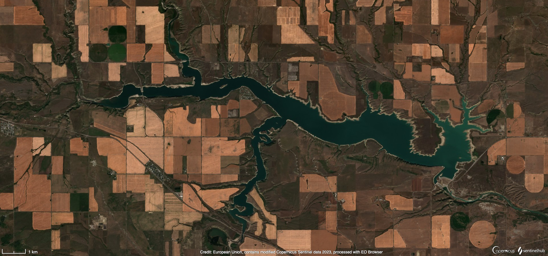
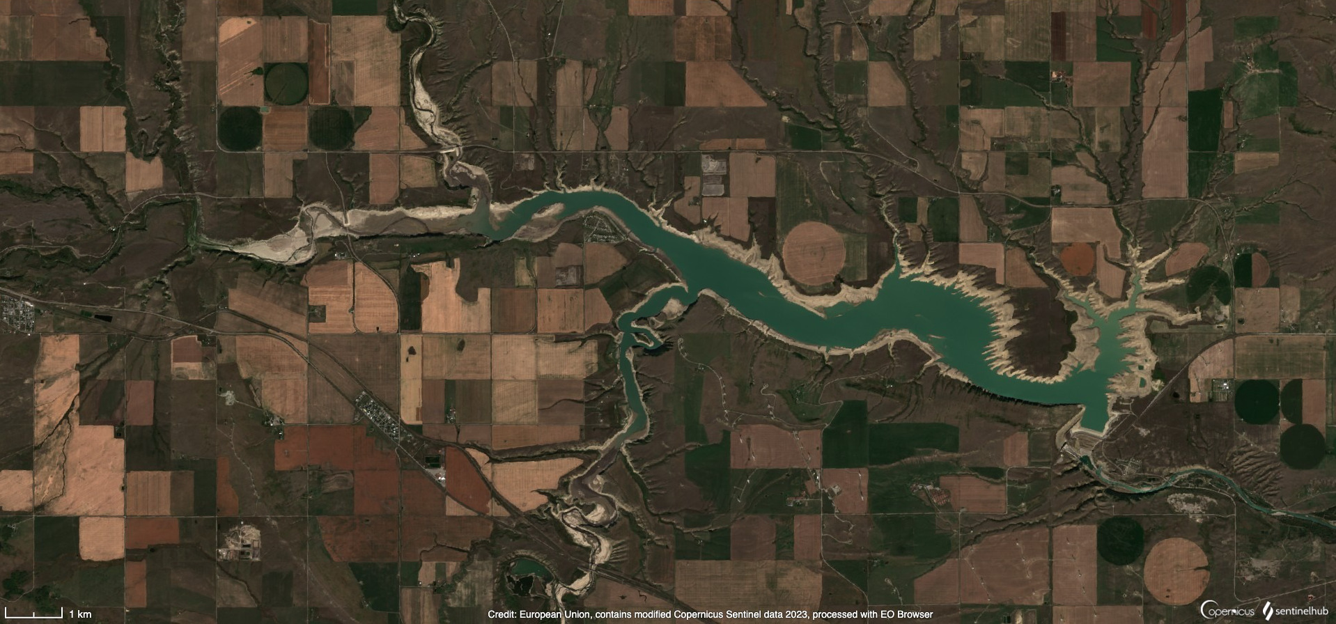
Figure 13: The Oldman Reservoir in southern Alberta showing the difference in water level in mid-September between 2022 (left) and 2023 (right). Image source: Sentinel-2 via Sentinel-Hub EO Browser
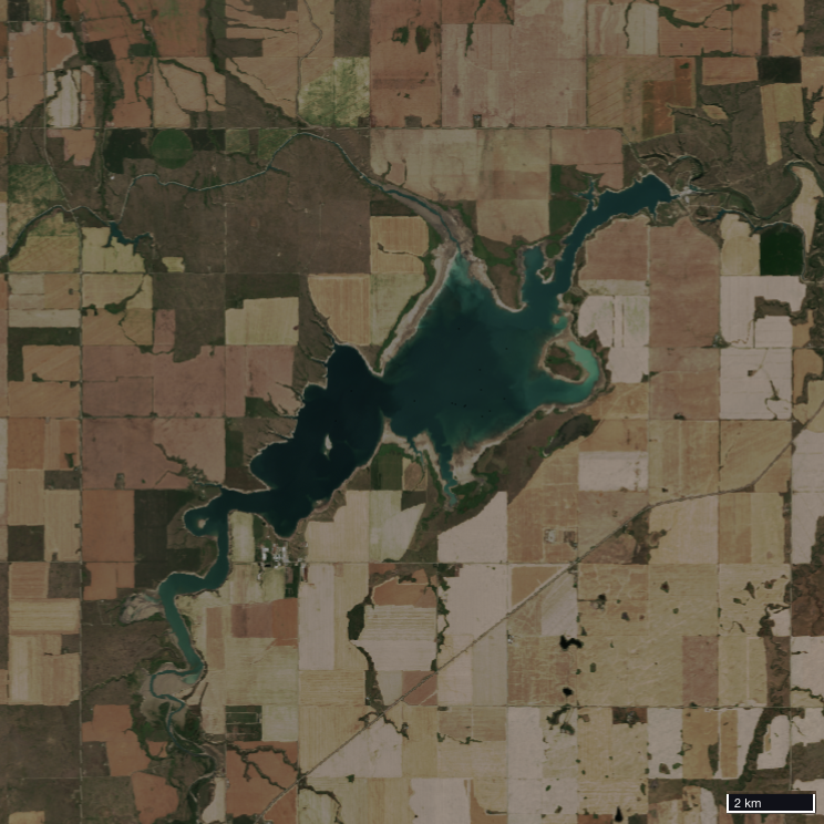
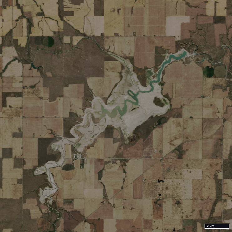
Figure 14: The St. Mary’s Reservoir in southern Alberta showing the difference in water level in mid-September between 2022 (left) and 2023 (right). Image source: Sentinel-2 via Sentinel-Hub EO Browser
From the Local to the Global – an Uncertain Future
I said at the beginning that this was a personal story. My household water is supplied from a nearby reservoir, which also irrigates the fields surrounding my property. This year, due to the severe drought, our irrigation district issued a warning they may need to cut off the supply of water early due to depletion of the reservoir. While this did not come to pass, it may be a preview of things to come. Living in this area, I cannot help but worry about what the future holds.
But this is not just a local problem for southern Alberta: the neighbouring province of Saskatchewan was also severely impacted by drought in 2023. As a major exporter of agricultural products, droughts in Canada can have impacts globally. In a time of increasing food insecurity around the world, reduced agricultural production in Canada risks making the problem worse.
Looking beyond Canada, as the climate warms, rainfall patterns are changing, with severe droughts increasing in many parts of the world. 2023 is predicted to be the warmest year on record, and 2024 may be hotter still. At the same time, the global population continues to rise, with an extra 2 billion mouths to feed expected by 2050. If we are to meet the needs of a growing population within the reality of a changing climate, we must find ways to adapt our agricultural practices, and soon.
I would like to offer sincere thanks to Planet for providing the data that made this work possible. Thanks to Darren Wiens, Justin Robinson, and Melissa Nunes for helping me overcome some technical hurdles I encountered along the way. Thanks to Alan Leonard for reviewing and revising these posts to help them be the best they could be. Thanks to James Banting for bringing this project to me, helping to shape it, and giving me flexibility in how to approach it. And finally, thanks to Sparkgeo for allowing me to engage in interesting and meaningful work like this.