You may have heard of accessibility as being referred to as A11Y. A11Y is what’s known as a numeronym. The first and last letters of “accessibility” are preserved, replacing the remaining letters between with their sum total of 11.
Digital accessibility is much more than just making your website or service screen readable. It’s the answer to the question “Is everybody able to use and access your service when they need to?” There’s a wide range of disabilities with different levels of severity. Web maps can be a big source of frustration for users with disabilities because they rely so heavily on visuals, require some precise mouse movement, and can be a lot of information to take in all at once. By keeping web accessibility in mind and making it an intrinsic part of your application, everybody is going to benefit.
Web Map Accessibility–it’s not great.
In writing this blog post, I started to familiarize myself more with how screen readers interact with web maps. It’s not great. (Full disclosure, I’m not that great at using a screen reader either). I found a visually beautiful map showing how climate change is predicted to affect the mean monthly max temperature in different parts of the world. It was well designed and concise in how the data was presented. When I got to the map with the screen reader, all the screen reader said was “MAP”.
That clearly doesn’t convey the meaning or purpose of this map to somebody using a screen reader. All it does is lets them know is that there is a map. So how could this map be made more accessible?
Data
We can start with what exactly makes a web map inaccessible in the first place. A map is basically a data visualization. It’s the visual part that makes it inaccessible in most cases. If your data was in a tabular format to start with, consider making it available to download. Presenting just the data to download as an alternative to viewing that data on a map can be very helpful. Users with visual disabilities could then use a program of their choice to browse the data.
If the data doesn’t make sense on its own, consider making the content of the map readable by a screen reader. A good example of this is a map that gives a user directions. Just showing the directions on the map helps sighted users, but having your application present the directions in a format that allows a screen reader to read them aloud will help blind or partially sighted users.
Colourblindness
Some users may not need to download the data, but may instead just have a hard time seeing and understanding features on your map. The National Institutes of Health reports that colourblindness affects up to 8% of males and 0.5% of females of Northern European descent. So even if only 3% of your users experience a red-green colourblindness, that’s more than 10 million people in Canada and the US.
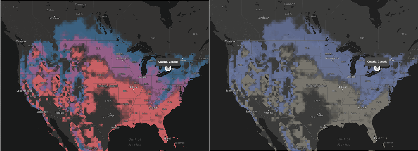
You can maybe see–if you’re not colourblind–that the map on the right lacks some colour definition.
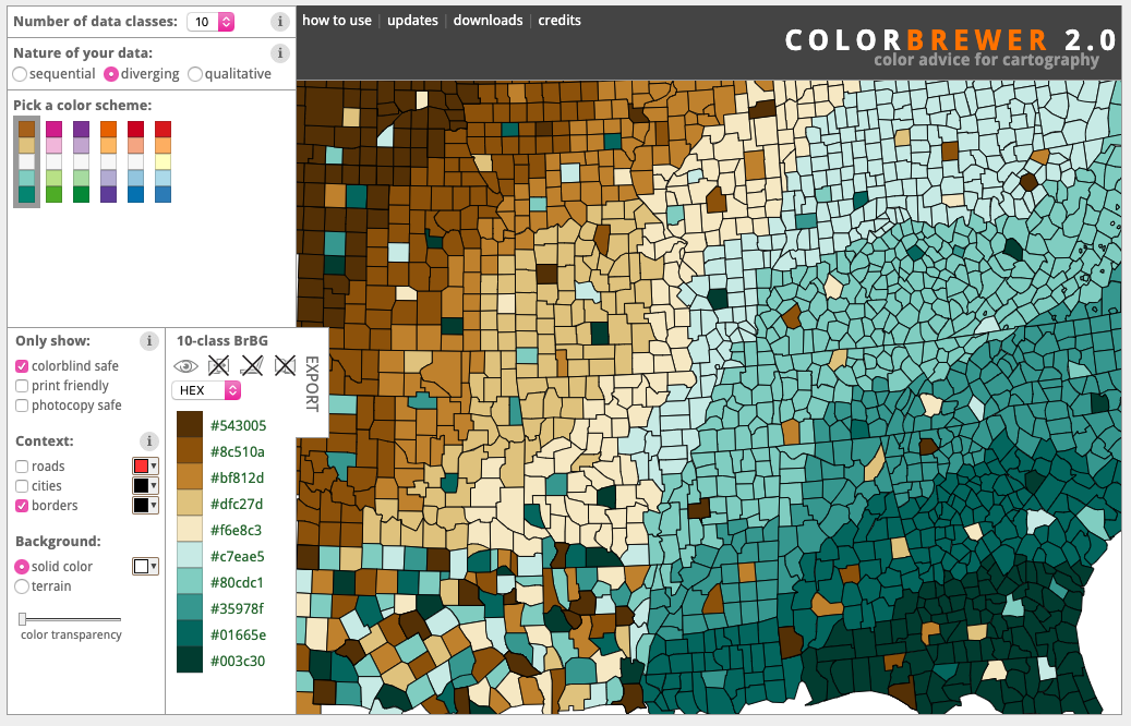
colorbrewer2.org is a tool that can help you if you have multiple data classes for any visualization. You can select “Colorblind safe” mode and it will give you different palettes you can use.
Contrast
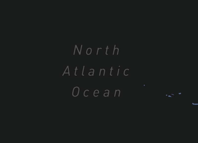
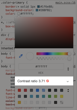
The inability to read low contrast text may not always be a physical condition, it could be environmental. For example, if you look at the Climate Change map, the labels for the ocean are at a colour contrast of 2.2:1. (Where black-on-black is 1:1 and white-on-black is 21:1. 4.5:1 is the minimum according to the Web Content Accessibility Guideline). I had a hard time reading the labels in my office on a sunny day because of the bit of the glare on my monitor.
There’s a tool made by WebAIM where you can check the contrast of text. It checks the foreground and background colours against the guides set by The Web Content Accessibility Guidelines and will tell you if it passes the standards. I recently noticed that a tool like this is built right into the Chrome developer tools.
A good rule to follow is to never rely solely on colour to convey meaning. Make use of textures, icons, labels, and shapes to identify different features and areas on your map.
Motor Skills
Not all disabilities are visual. Some people have difficulty moving parts of their bodies. Making precise movements like moving a mouse or using a trackpad could be a challenging task for them. Things that an able-body person may take for granted like clicking-and-dragging may be much more difficult for somebody who is unable to press and hold a button, for example.
Keyboard shortcuts are a big piece to the accessibility and usability puzzle. Having the ability to control and navigate the UI without the need for fine motor skills like operating a mouse, or the good vision to follow a mouse cursor on screen can help a wide range of users with disabilities and without.
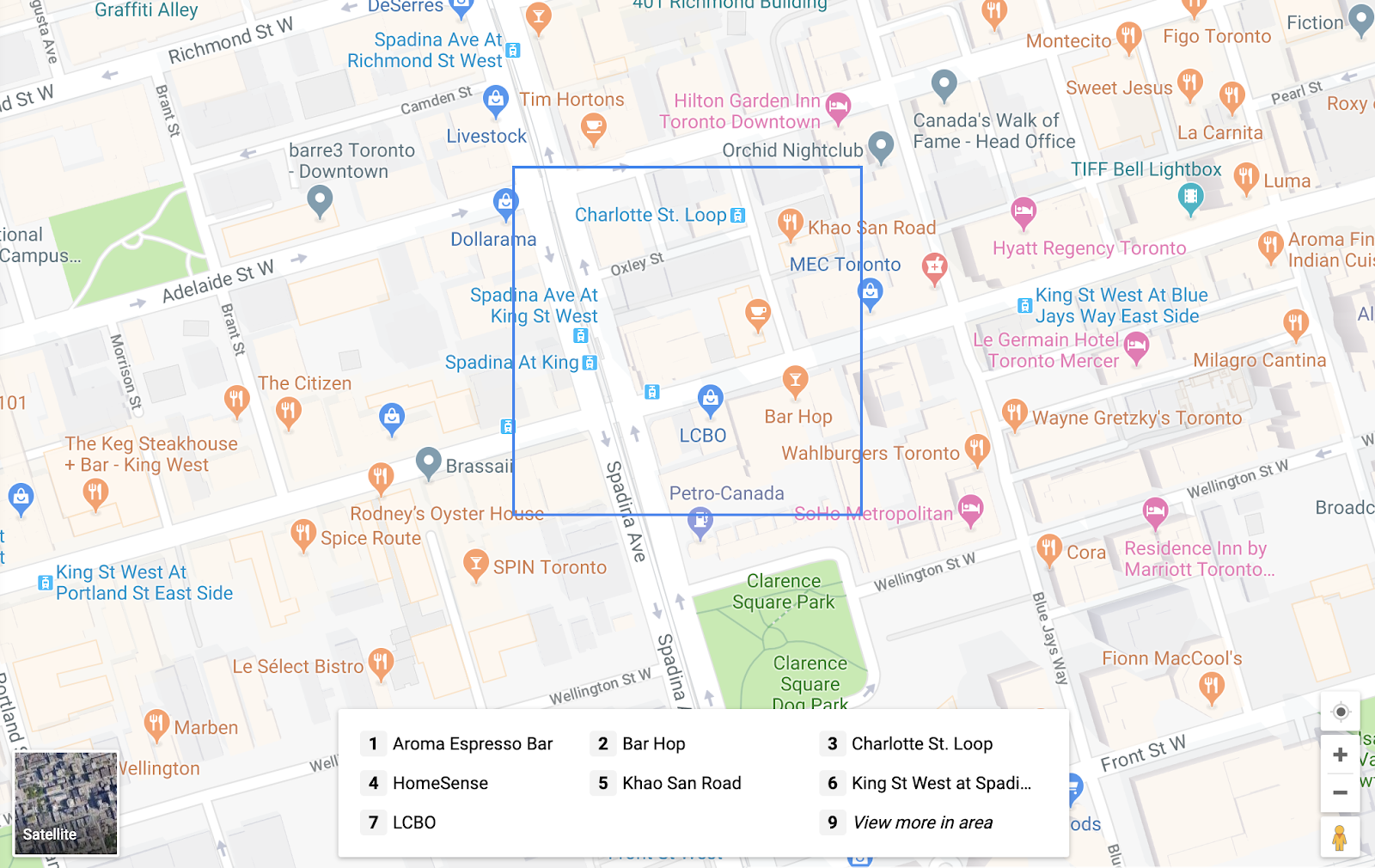
Implementing keyboard shortcuts into your application or map is a great way to allow users to have a different method of navigation. I found that some of the major mapping platforms do a much better job than others. Bing Maps allows you to move the map around with the arrow keys, but that’s all I figured out how to do. Google Maps had an interesting approach where they put a smaller box on the map, then listed the points of interest in that box in an index below. Shift+item-number from the index brings up information on that point of interest.
This adds another layer of functionality to the map that allows more people to be able to access the service. It doesn’t detract from the main map functionality but instead, adds to it.
Accessible Rich Internet Applications
ARIA is a set of HTML attributes that define ways to make web content and web applications (especially those developed with JavaScript) more accessible to people with disabilities. I’m not going to get too much into ARIA in this post as I’m not primarily a developer. If you want to learn more, follow that link up there or a quick search with your favourite search engine will give you plenty to read.
Keep accessibility in mind
This is a very broad topic and is constantly changing. In this post I only covered a few methods–I didn’t even mention mobile at all. Every map is different so there’s no single answer to how to make your map accessible. However, you can follow these few guidelines and it will make a big difference to your map or application.
- Explain the goal of your map and what it’s showing
- Provide data in an alternative and accessible format
- Don’t rely solely on colour to convey meaning. Use textures, icons, labels, and shapes
- Use colours that pass contrast minimum standards and are colourblind safe
- Use ARIA and proper HTML semantics
- Build keyboard shortcuts into your app
When you keep accessibility in mind, your users with accessibility needs will be much less frustrated.
Resources:
The A11y Project – a really great and concise resource for all things accessibility.
Accessible Web Maps for Visually Impaired Users: Recommendations and Example Solutions – A great paper that covers usage and guidelines on how to build maps for people with visual impairments.
Accessible Rich Internet Applications – the documentation on MDN
https://developer.mozilla.org/en-US/docs/Web/Accessibility/ARIA
Web Accessibility In Mind – a great source for a lot of different accessibility tools
Color Brewer 2 is a diagnostic tool for evaluating the robustness of individual color schemes including colourblind safe colours. This was linked above in the colourblindness section.
How to use the accessibility features on Google Maps
https://support.google.com/maps/answer/6396990?co=GENIE.Platform%3DDesktop&hl=en
Wiki Page for Open Street Map for the blind
https://wiki.openstreetmap.org/wiki/OSM_for_the_blind
W3.org recommendations and guidelines on accessible maps