2023 has been a landmark year for extreme weather around the world. Globally, there’s been deadly tropical cyclones and hurricanes, devastating floods, deadly cold snaps, record breaking ocean heat, and more.
Here in Canada, a combination of severe heat waves and scarce precipitation have led to the worst wildfire season on record. Over 18.5 million hectares of land have been burnt, vastly surpassing the previous record of 7.1 million hectares. We at Sparkgeo have written previously about wildfires in Canada; given the devastation of 2023, we most likely will again.
The same warm and dry conditions that fueled the wildfires led to an other dire issue: drought.
Drought in Alberta
The Canadian province of Alberta is perhaps best known for its oil and gas industry. However, agriculture is among the oldest industries in the province, and remains an important engine of economic activity. In 2021, Alberta agriculture contributed over $8 billion in GDP and exceeded $14 billion in exports.
2023 brought significant drought to the province, with multiple municipalities declaring agricultural disasters. This follows closely on the heels of another severe drought in 2021, the worst drought in the province in 60 years.
Faced with this bleak situation, many farmers will need to rely on crop insurance to see them through to next year.
Alberta’s extensive cattle ranching industry is also impacted by the drought. Cattle grazing pastures have suffered greatly reduced growth, increasing demand for supplemental cattle feed. This increased demand coupled with the poor growing conditions has caused the price of feed to rise sharply, forcing many ranchers to thin their herds. Even with better moisture conditions in the future, building these herds back up will take time, likely resulting in long-term price increases for beef.
Monitoring Drought with Satellite Imagery
We can monitor drought conditions and the health of crops over time using satellite imagery. Vegetation indices (VIs) are derived from satellite images and are highly correlated with plant health and growth. The most widely used vegetation index is the Normalized Difference Vegetation Index (NDVI) which combines information from measurements of visible and near-infrared light reflecting from crops.
NDVI is expressed as a decimal number ranging between -1 and 1, where higher values correspond with healthier or denser vegetation, while lower values can correspond with stressed or sparse vegetation, and/or non-vegetated surfaces. Since drought causes significant stress on crops, we can see it expressed through reduced crop NDVI.
NDVI from a single image can provide some useful information about crops, such as how the crops are growing between one part of a field and another, or how one field compares to another. But the real power of NDVI is when it’s used with a time series of satellite images, allowing the growth of crops within a season, or between different seasons, to be analyzed and compared.
Figure 1 shows a typical NDVI time series plot for an agricultural field in North America, comparing a healthy and stressed crop. Early in the season, NDVI is low, since the crops have not yet emerged. Once the crops begin growing, NDVI increases rapidly, reaching its peak in the summer months. This is followed by a gradual decline as the crop reaches the end of its life cycle, drying out and stopping photosynthetic activity, a phase which is typically followed by harvesting.
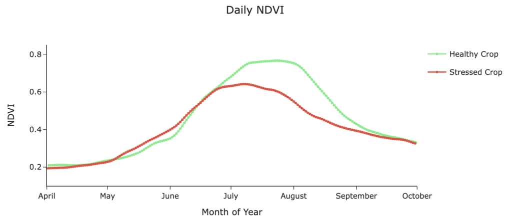
Comparing the healthy and stressed crops, we can see that the stressed crop reaches its peak NDVI earlier in the season, achieves a lower peak NDVI, and declines earlier as well. NDVI for both healthy and stressed is similar in the early and late season.
It is important to note that the patterns of NDVI can vary from field to field and crop to crop, and their responses to stress may differ as well. Thus, whenever possible it is best to ensure the same fields and same crops are being compared between different growing seasons.
Mapping Crop Growth Across the Province
We wanted to look at the impact of the drought across the entire province at a coarse scale. For this we used NDVI from the Moderate Resolution Imaging Spectroradiometer (MODIS) satellite, which provides data at a resolution of 500 meter pixel size.
We retrieved MODIS data over the entire province from the years 2018 to 2023. From this time series we calculated the maximum for each pixel in each year. We then calculated the difference between 2023 and all previous years. You can view the results of this analysis in a web map.
Figure 2 shows the layout of the web map:
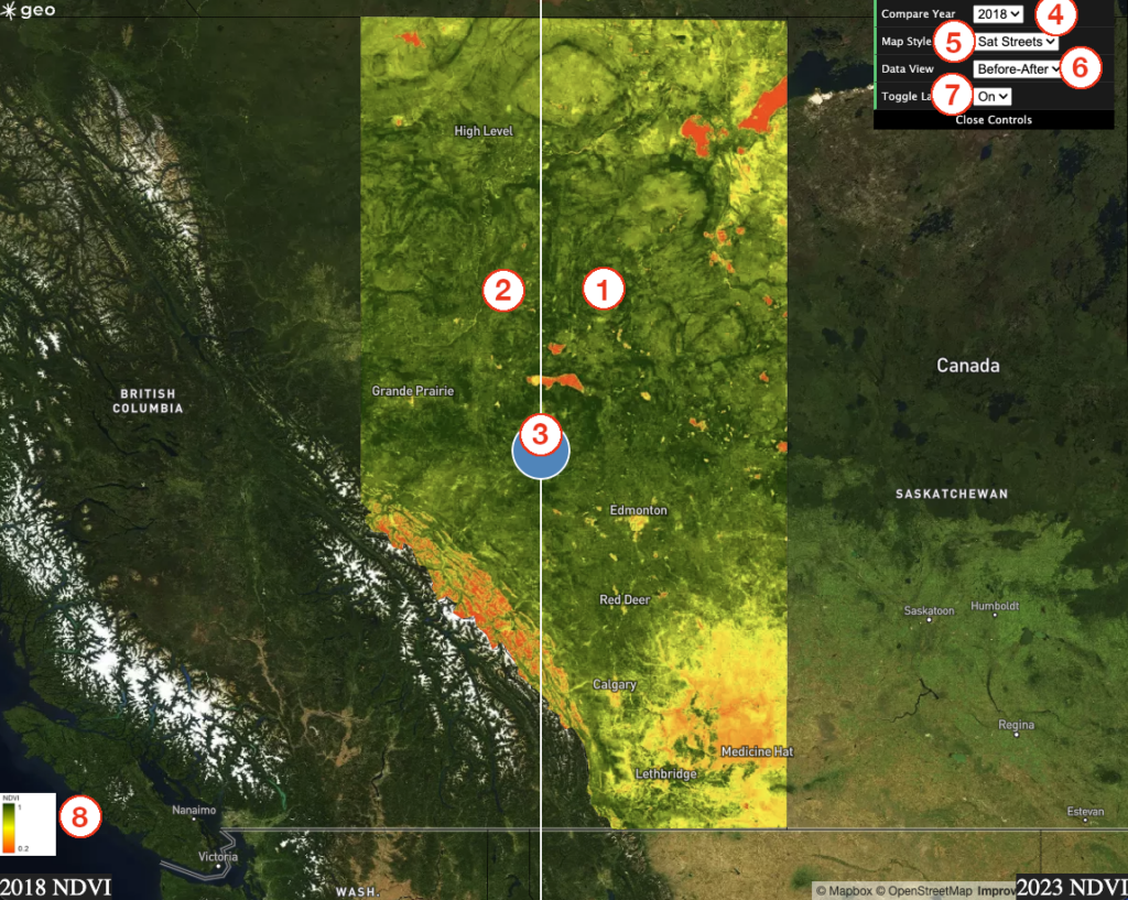
Figure 2: Layout of the crop growth web map.
- The map on the right always displays the NDVI for 2023.
- The map on the left shows the NDVI for the selected comparison year.
- The slider can be used to swipe between the two years being compared.
- Use the “Compare Year” button to swap between different comparison years (2018 – 2022).
- Use the “Map Style” button to select between different base maps.
- Use the “Data View” button to select between the “Before-After” data view and the “Difference” view (more on this below).
- Use the “Toggle Layers” button to turn all data layers on or off, allowing you to view the basemap.
- The Legend in the lower left shows how the NDVI data is being symbolized.
Using the default view of the map, you may compare the NDVI for 2023 with any previous year between 2018 and 2022. The map colour represents the maximum NDVI experienced by that area in that year; areas that are more red indicate lower NDVI values, while darker green indicates higher NDVI values.
The “Data View” button allows you to display an alternative view of the data, the “Difference” view. Figure 3 shows what the Difference view looks like:
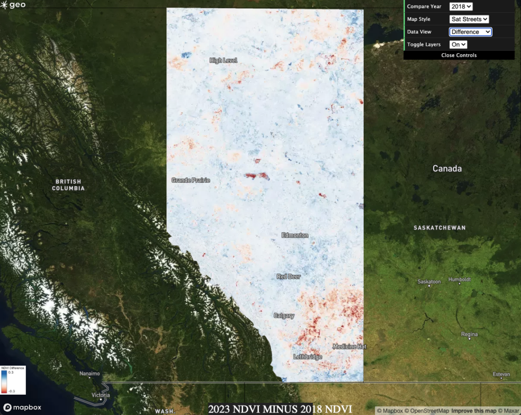
Figure 3: Difference view on the web map. Select this view using the “Data View” dropdown in the upper right.
In the Difference data view, areas shown in blue represent an increase in NDVI between the selected Compare Year and 2023, while areas in red show a decrease between the years. Areas in white indicate minimal change in NDVI between the two years.
Examining the map, we can make some inferences. While we encourage readers to explore the web map on their own, we will be including some visuals from it to accompany the discussion below.
Poor crop growth in the south; burn scars in the north
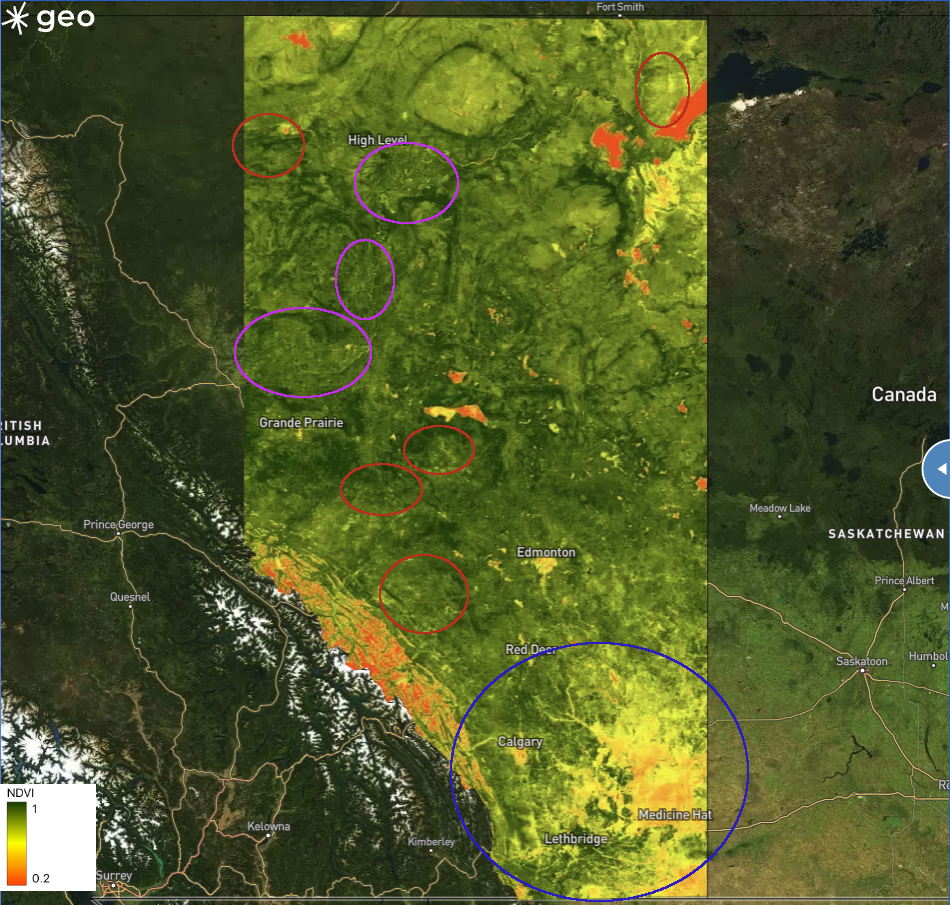
Peak NDVI in the southern part of the province—south and east of the city of Calgary—was notably lower in 2023 than in most previous years (blue circle, Figure 4). On the other hand, much of central and northern Alberta saw similar NDVI values in 2023 compared to most other years. Some agricultural areas in northern Alberta also experienced lower NDVI in 2023, such as near the communities of Grande Prairie and High Level (purple circles, Figure 2). Finally, several burn scars from 2023 are evident in the NDVI (red circles, Figure 4), showing the importance of context when interpreting remote sensing observations.
Figure 4: Comparison of 2018 and 2023 maximum NDVI. Blue circle indicates the south region which experienced worsened crop growth. Purple circles show northern agricultural areas which also suffered worsened crop growth. Red circles show burn scars from 2023 wildfires.
2023 was bad; 2021 was worse
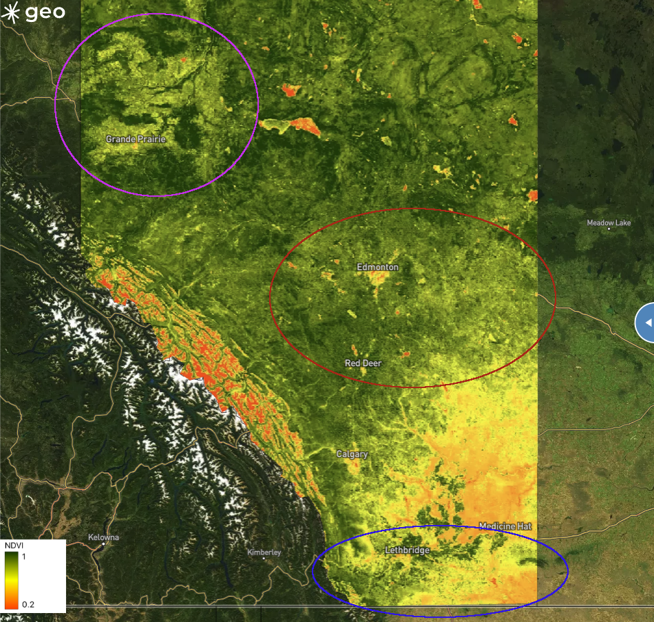
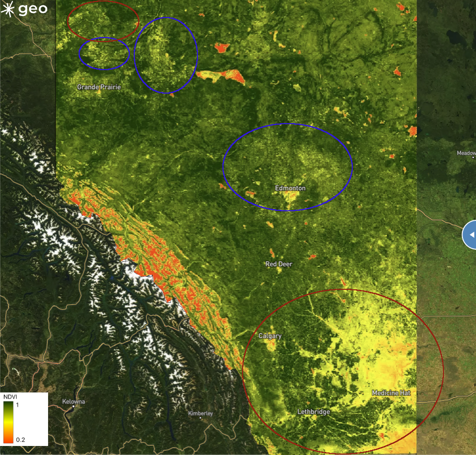
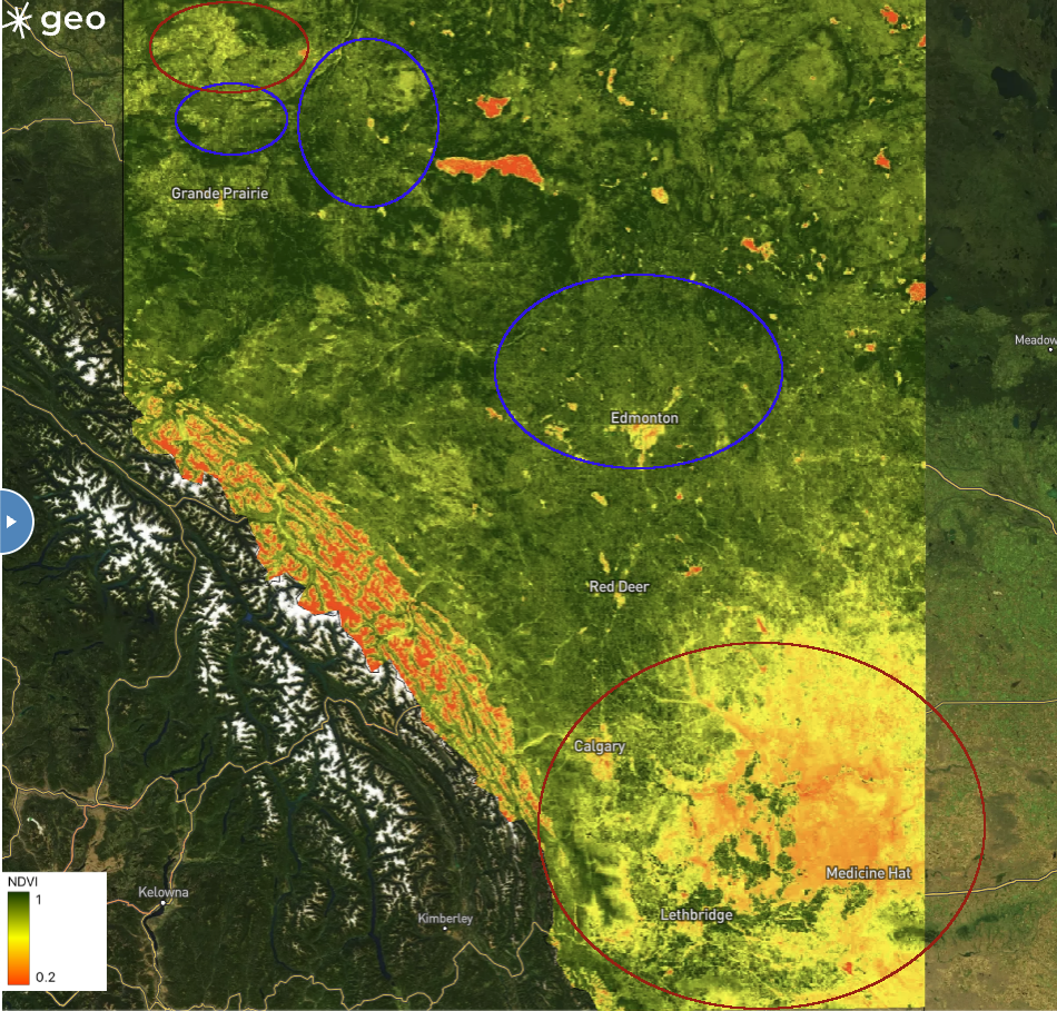
2021 appears to have been a more significant drought than 2023. Comparing 2023 with 2021, peak NDVI was marginally to significantly lower in 2021, suggesting that crops were more severely impacted by the 2021 drought. In particular we see this with crops in the north-western province near the city of Grand Prairie (purple circle, Figure 5), the region around the city of Edmonton (red circle, Figure 5), as well as the far south of the province close to the United Stated border (blue circle, Figure 5). As mentioned earlier, 2021 was the worst drought in the province in over 60 years, so it is perhaps unsurprising to see this is the case. In fact, given the severity of the 2021 drought, seeing the overall similarity between 2021 and 2023 is very concerning.
Figure 5: Comparison of maximum NDVI between 2021 (left) and 2023 (right). Circled regions indicate areas where crop growth appears to have been more severely impacted by the drought in 2021 than in 2023.
Crop growth in 2020: good in the south, mixed in the north
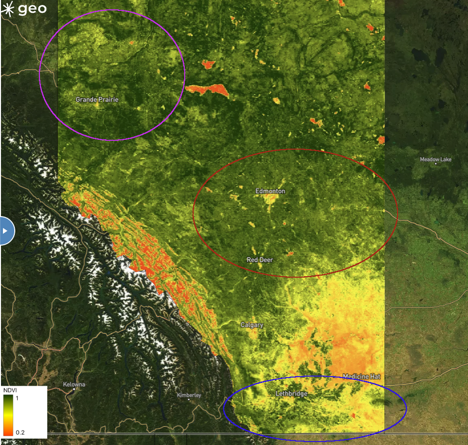
Comparing 2020 with 2023, it is clear the crops in the southern part of the province did much better in 2020 (Figure 6). This observation is in line with this article, showing that over 86% of crops in southern Alberta were rated as “good-to-excellent”. On the other hand, further north in the province, we can see that the crops surrounding the city of Edmonton appear to have done somewhat better in 2023 compared to 2020. Same with the crops surrounding Grand Prairie, though some of the crops north of the city were lower in 2023.
Figure 6: Comparison of maximum NDVI between 2020 (left) and 2023 (right). Regions circled in red experienced lower NDVI in 2023, while regions circled in blue experienced higher NDVI in 2023.
Irrigation softens the blow
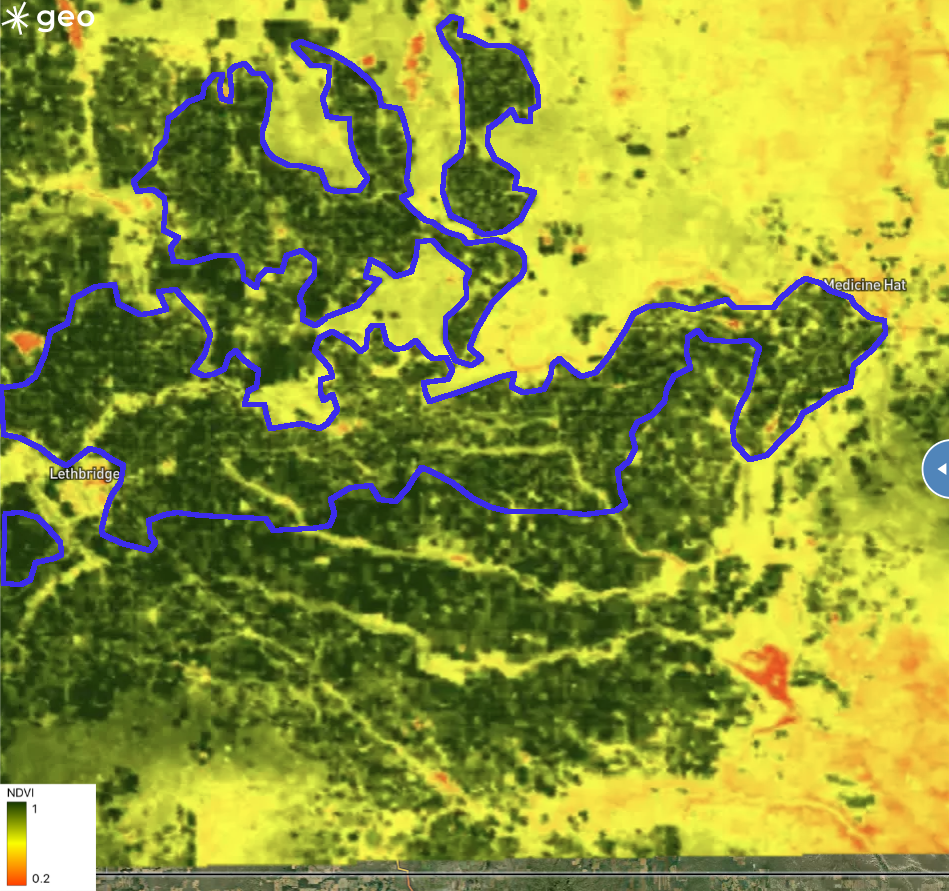
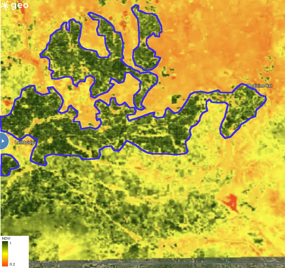
Looking at the south of the province again, we can see that while peak NDVI was low for most of the crops in 2023, there are large swaths of land that seem to have been minimally affected by the drought, achieving high NDVI values similar to previous years. For example, we see this in the area between the city of Lethbridge and city of Medicine Hat (Figure 7). Here we see the impacts of irrigation.
Figure 7: Comparison of maximum NDVI between 2020 (left) and 2023 (right) in southern Alberta. Areas outlined in blue are primarily irrigated croplands.
Alberta has extensive irrigation, with almost 700,000 hectares of irrigated land—approximately 70% of the total irrigation in Canada—with the majority being in the south of the province. Irrigation is critical to the agricultural productivity in the southern region, providing a stable and reliable water supply that can mitigate the highly variable moisture of the semi-arid southern Alberta climate. We see this stabilizing effect on the map, with consistently high NDVI within the irrigated crops across all the years studied.
In Part 2: Taking a Closer Look
This analysis clearly shows the impact of drought on crops in Alberta. We saw the severe droughts in 2021 and 2023 resulted in much lower peak NDVI values, particularly in the drier southern part of the province. Unfortunately, the coarse spatial scale of MODIS data, along with only assessing the peak annual NDVI, may leave out some potentially useful details.
In Part 2 of this work, we will take a more detailed view, examining daily, high resolution NDVI time series data across a selection of agricultural areas in Alberta.
You can read Part 2 here.

